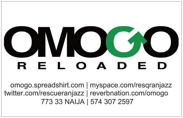
According to O'Guin, Allen and Semenik in their book Advertising and Intergrated Brand Promotion, the new world of advertising is full of companies who are looking for new ways to get their brand across to audience and potential consumers. In this seemingly ad cluttered environment, small businesses are caught in the struggle between big corporation on how to make their brand visible and recognizable, send out culturally relevant in a refreshing way and become top-on-the-minds of audience and potential customers. How can new small businesses favorably compete considering the criteria listed above. Let us examine one of ResQ Records brand: The Omogo Reloaded Logo. The Omogo Reloaded logo is good because it is simple, representative and fresh.
Omogo Reloaded brand, Yahoo, Disney and Taco Bell brand all have something in common: Simplicity. When encountered, they are supposed to evoke some sort of feelings in the minds of audience. In comparison, the 4 brands have visual simplicity. These brands employ texts and sometimes an image (as seen in TACO BELL). In the music industry, ResQ Records is a new player with a relatively new genre of music called Afrofusion. The logo just spells the brand out in bold uncomplicated type-face, the smaller font well spaced to hold the weight of the larger ones on top. There are just two colors: Green and black plus the neutral white. The task is to clearly communicate the essence of the music to potential audience and customers and keeping the new logo simple will make recall and association easy for music enthusiasts, potential industry business partners and customers. Simplicity is synonymous to recall and easy recognizability and the Omogo Reloaded brand has that quality.
As Disney appeals to the fun-loving population and Yahoo to the instant messaging internet users, the Omogo Reloaded logo is packed with cultural appeal. The text is set in white background with green on either side. Green-White-Green is the flag of Nigeria, where Afrofusion originates evolving from Afrobeat. According to WorldFlags101.com, " The green stripes represent Nigeria's agriculture industry and its lush vegetation and the white stripe represents the desire for peace and unity within the country". In relation to Afrofusion blend of music, the green and white mean flourishing in harmony. Brand logos do not just represent names, they carry meanings. Here in North America, almost everyone is familiar with the recycle symbol. It is also used as part of the brand. Representation is what makes the Omogo Reloaded logo better. It is packed with meaning of cultural relevance that an African, American and global audience can relate to.

Notice that the "G" in Omogo has been slightly and intentionally rotated to imitate recycle symbol and the refresh button. This symbol is common on the internet and eye-catching. It represents giving vitality to something that may be worn out. Refreshing, starting afresh and new are the intended messages. At the same time, the rotated "G" also represent ResQ Records consciousness of the diminishing state of the world's resources and our support for the green revolution like encouraging dowloads and reading electronic copies instead of print-outs. The world craves new and refreshing ideas and the Omogo Reloaded brand represents just that. The word, "Reloaded" is implied in the rotated "G" and along the line of brand evolution, all other elements on the logo will be dropped. Like the NIKE swoosh, the slightly tilted G with a arrow head will come to identify Afrofusion music by Omogo Reloaded, percieve as something new/fresh and infigurating.
It's lunch time and you're driving on highway 33, when you spot a fast food restuarant sign. Almost immediately, you're feeling hungrier. Result and that's what an advertisers in that industry desire.
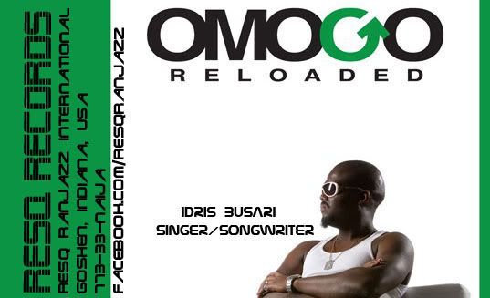
For the Omogo Reloaded brand, the composition is created to stimulate ones imagination by arousing one's curiousity. A look at top ranking national and international brands will reveal their simplicity, their struggle to be very represnetative and relavant in meaning transmission to audience and strive to stay fresh. The Omogo Reloaded brand possesses the above-mentioned qualities, making it very easy to recall. Upon immediate recognition and recollection, certain subtle cultural messages are conjured and a sense of affiliation with the brand is established. It is easy to support a brand that customers have a connection with. This connection is importnat to the survival of a brand.
