south (3)

QR CODE/MOBILE MARKETING

The music business has been and is undergoing crazy changes that is shaking up all the major and small players in the industry. The problem is not the evolution of a different way of manipulating and consuming media but the failure of the player to foresee and yield to these changes.


In studying entrepreneurship last semester, I came across the concept of "creative destruction" which for example had eliminated the elevator man and made extinct the typewriter. On the other hand, the same concept has improved the functionality of the cellular phones and mobile devices, which has become the "now" gadget of the 21st century and beyond. If these devices get smarter, they will start to walk.


Before I ramble off topic, I want to implore us not to be like some in the music industry and  ignore the mobile device revolution. Their enhanced functionality/usability has made these devices indispensable to us and their sheer convenience has made them more indispensable to our potential consumer,their new personal companion and 24/7 personal assistant, decision-maker and shopper.


As of today, in light of the confusion in the music industry and the advancement in communication technology, it may be wise to adopt the QR code/mobile marketing early. You don't have to be a sorcerer to  see the future as it is coded in black and white.


Bob Dylan said it right,"The times, they are a changing." We either embrace it or like the some in the music industry, face exinction, FOREVER.
 

Read more…
Photobucket


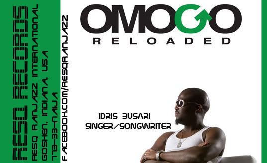
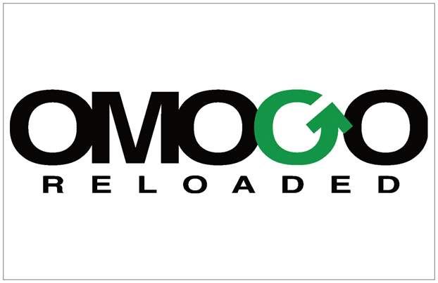
According to O'Guin, Allen and Semenik in their book Advertising and Intergrated Brand Promotion, the new world of advertising is full of companies who are looking for new ways to get their brand across to audience and potential consumers. In this seemingly ad cluttered environment, small businesses are caught in the struggle between big corporation on how to make their brand visible and recognizable, send out culturally relevant in a refreshing way and become top-on-the-minds of audience and potential customers. How can new small businesses favorably compete considering the criteria listed above. Let us examine one of ResQ Records brand: The Omogo Reloaded Logo. The Omogo Reloaded logo is good because it is simple, representative and fresh.


Photobucket


Omogo Reloaded brand, Yahoo, Disney and Taco Bell brand all have something in common: Simplicity. When encountered, they are supposed to evoke some sort of feelings in the minds of audience. In comparison, the 4 brands have visual simplicity. These brands employ texts and sometimes an image (as seen in TACO BELL). In the music industry, ResQ Records is a new player with a relatively new genre of music called Afrofusion. The logo just spells the brand out in bold uncomplicated type-face, the smaller font well spaced to hold the weight of the larger ones on top. There are just two colors: Green and black plus the neutral white. The task is to clearly communicate the essence of the music to potential audience and customers and keeping the new logo simple will make recall and association easy for music enthusiasts, potential industry business partners and customers. Simplicity is synonymous to recall and easy recognizability and the Omogo Reloaded brand has that quality.


Photobucket


As Disney appeals to the fun-loving population and Yahoo to the instant messaging internet users, the Omogo Reloaded logo is packed with cultural appeal. The text is set in white background with green on either side. Green-White-Green is the flag of Nigeria, where Afrofusion originates evolving from Afrobeat. According to WorldFlags101.com, " The green stripes represent Nigeria's agriculture industry and its lush vegetation and the white stripe represents the desire for peace and unity within the country". In relation to Afrofusion blend of music, the green and white mean flourishing in harmony. Brand logos do not just represent names, they carry meanings. Here in North America, almost everyone is familiar with the recycle symbol. It is also used as part of the brand.  Representation is what makes the Omogo Reloaded logo better. It is packed with meaning of cultural relevance that an African, American and global audience can relate to.


Photobucket


Notice that the "G" in Omogo has been slightly and intentionally rotated to imitate recycle symbol and the refresh button. This symbol is common on the internet and eye-catching. It represents giving vitality to something that may be worn out. Refreshing, starting afresh and new are the intended messages. At the same time, the rotated "G" also represent ResQ Records consciousness of the diminishing state of the world's resources and our support for the green revolution like encouraging dowloads and reading electronic copies instead of print-outs. The world craves new and refreshing ideas and the Omogo Reloaded brand represents just that. The word, "Reloaded" is implied in the rotated "G" and along the line of brand evolution, all other elements on the logo will be dropped. Like the NIKE swoosh, the slightly tilted G with a arrow head will come to identify Afrofusion music by Omogo Reloaded, percieve as something new/fresh and infigurating.


Photobucket


It's lunch time and you're driving on  highway 33, when you spot a fast food restuarant sign. Almost immediately, you're  feeling hungrier. Result and that's what  an advertisers in that industry desire.


Photobucket


For the Omogo Reloaded brand, the composition is created to stimulate ones imagination by arousing one's curiousity. A look at top ranking national and international brands will reveal their simplicity, their struggle to be very represnetative and relavant in meaning transmission to audience and strive to stay fresh. The Omogo Reloaded brand possesses the above-mentioned qualities, making it very easy to recall. Upon immediate recognition and recollection, certain subtle cultural messages are conjured and a sense of affiliation with the brand is established. It is easy  to support a brand that customers have a connection with. This connection is importnat to the survival of a brand.


Photobucket

Read more…
Travel, Study, Job Placement and Visa ServicesFuture Impressions Travel and Tours (Ghana) is a subsidiary of Virginfield Tourism UK. As the name implies, our company is experienced in the provision of value-added services in the world of Travel & Tourism, Education, Job Placement and Visa (Immigration) service-providing outfit head quartered in Portsmouth, United Kingdom.We are based in UK, South Africa, USA, Canada, Ghana, Botswana and having overseas partners.Our services include:Study AbroadFlight Training InternationalJob PlacementVisa & Immigration ServicesCustomized Travel/Tour PackagesFor further information, email us at: fittghana@gmail.com or go to our website: www.virginfieldtourism.com
Read more…

Blog Topics by Tags

  • in (506)
  • to (479)
  • of (339)
  • ! (213)
  • as (166)
  • is (157)
  • a (156)

Monthly Archives